Social Dude
How to create a compelling product page that sells? - MailPod
How to grab visitor's attention in nanoseconds? Create a product page that automatically induces sales. Visuals play a very dominant role in our day to day life, and they are as important in the business world. In this digital era, if you want your visitor or potential customer to stay, then you have to create a compelling product page. Your Product Page is the deciding factor, either you can make a sale or lose a potential customer. Also, the product page is the final page where customers make their purchases, so to create an ever-lasting impact, it should be attractive. MailPod helps you to create the best product page to induce happy sales. We also provide the best email marketing tool to help businesses communicate with existing and potential customers.
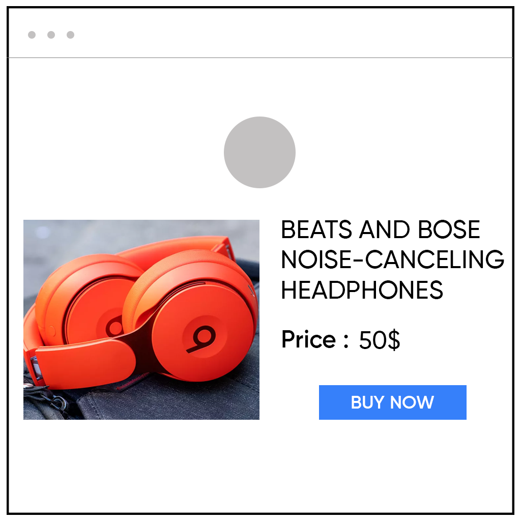
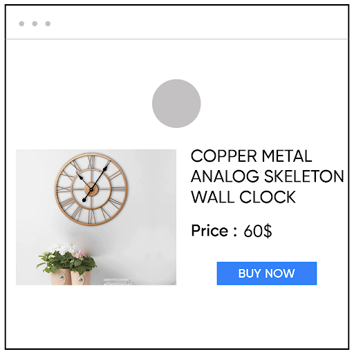
The Requirements of a Product PageIt is observed that a potential customer spends very little time on a website, so you have to spark an interest within a little time-span. You have to provide information on product description, product image, product price, and an option to shortlist or add to the cart. These details must be in bold, and it is advisable to display them on the top. As the pattern observed, people read information from the left to right, it is best to show crucial information in that sequence only. For example, if you sell clothes, you will show the product image on the left side, but in the case of a bigger product, you prefer to show product description on the left side.
The product images are displayed at the left side and the name and price of the product are displayed at the right side.In brief, you have to decide what is best for you, and design the product page according to that. Also, if you can grab the visitor's attention, then they may scroll down, and you can use that space to provide additional information. At the bottom, you can display testimonials, detailed features, or video tutorials to use the product. In all, you have to optimize your product page and display all possible information most engagingly.
What do you need to include in your Product Description?A product Description can make or ban your customer's decision of making a purchase. If it is compelling enough, then congratulations, you have an optimized product description, but if it is not, then you have to rewrite your product description to induce sales. You need to remember the few below-mentioned points while creating the best product description. If you follow these points, then your work will be much reduced.
Be Direct and To-The-PointRemember, your visitor may not have a lot of time to read your product description, so be direct and short. Highlight the special features and use bullets to attract attention. According to a study, 80% of visitors scan the website, instead of fully reading it. Try not to be salesy or unoriginal. Display the information to the point and use an attractive font. You can add further details later on the page, but only the main special features need to be published under product description that makes your product different from those of others.
Include FAQsAnswer the questions that you think may occur in the customer's mind. Surely, customers are aware of what they are buying, but it is also sure that other questions related to the quality and price also arise. You can solve their query without actually its occurrence. In this way, you become the problem solver, and the convenience is all a customer ever asked for. For example, you can mention the dimension of the object you are offering or the type of fabric offered. The best way to satisfy your customer is to anticipate their problems and solve them beforehand to avoid any problems.
Display the images that provide a live experienceWhen customers shop online, all they have is product images to rely on. Therefore, upload those images that provide the real sense of the product in terms of size, texture, or any other important feature.
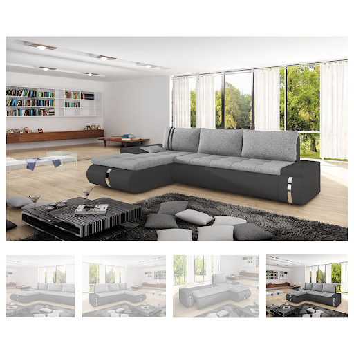
Use Multiple ImagesIt is better to use multiple images rather than only one. You can display the product from various angles and any special design of the product. A study shows that more than 70% of customers like to see over 3 images to establish the genuinity of the product. Do not worry if you are not an excellent photographer, all you need is high-quality images that can be clicked by high-resolution mobile cameras. Also, images with different angles help a customer to get an overview of the product. For example, if you are displaying a woman's dress, you can upload multiple images from the front look, back look, and length of the dress.
Upload the product from Different AnglesUpload Lifestyle ImagesIf you use an image with a real environment and people, customers will trust you more. For example, if you sell clothes, then you can ask customers who already bought that outfit to send an image in those for extra credit points or some attractive designs. If you sell furniture, then try uploading a picture of a furniture piece in the furniture store. This will provide a real-life experience to customers while shopping online, and chances of them staying or even buy increases.
Use a Clear Call-To-ActionA Clear Call-To-Action is the main component of every marketing segment, whether email marketing or social media marketing. You have to make a clear statement of what you want a visitor to do.
A clear CTA Button should be attractive and compelling. We have already covered the importance and way of presentation of Call-To-Actions, and now is the time to implement those.
At the bottom, you can show additional information regarding product review or video feedback of customers. You can also mention the contact details and ratings from customers.
If you are planning to create an awesome Product Page, then contact MailPod for creating user-friendly product pages. We will launch many related articles on How you can make a success out of product pages, till then keep tuned and subscribe to Mailpod for the best email marketing tool, guidance, and management.
For more details visit: https://mailpod.com/articles/how-to-create-a-compelling-product-page-that-sells/


Comments